StoreMate Dashboard Overview
1. Inquiry Summary
It shows Total value & count and percentage.
- Total: Added inquiries
- Interested: All inquiries except won, lost
- Won, Lost: Shows the monetary value (Rs.) and count of inquiries in each status.
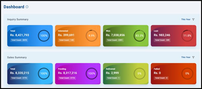
2. Sales Summary
Shows won sales by delivery status.
- Total: Sales
- Pending: Delivery pending
- Delivered: Delivered
- Failed: Returns
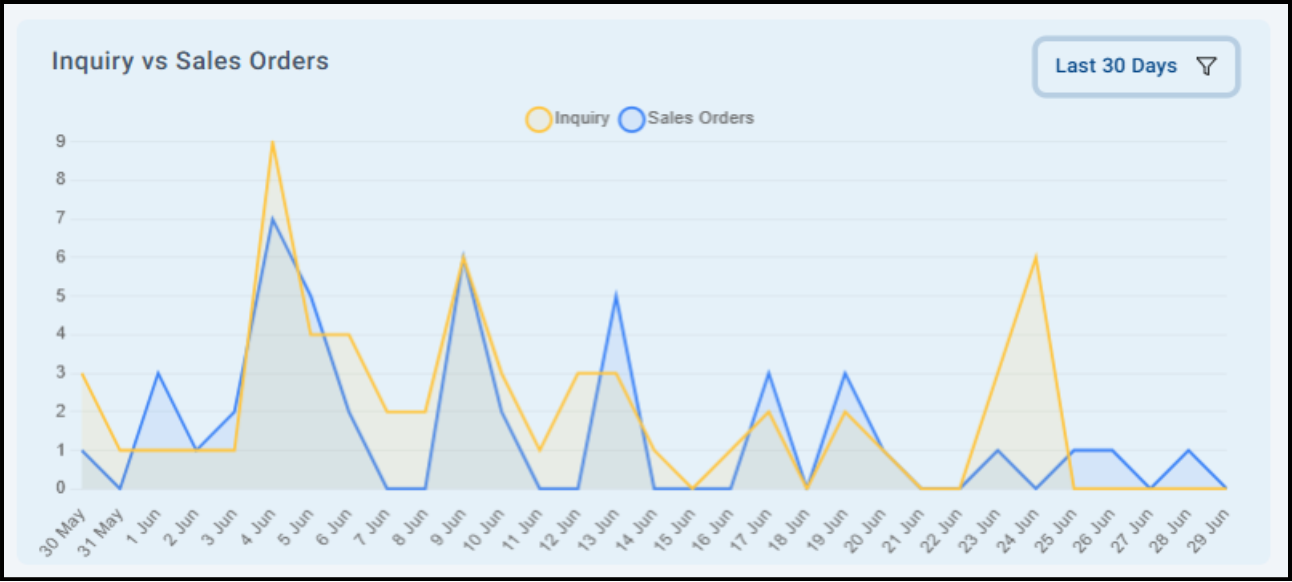
3. Inquiry vs Sales Orders (Graph)
A line graph comparing inquiries vs sales orders over the last 30 days.
- Yellow line: Inquiries
- Blue line: Sales Orders
- Use: Spot trends, peaks, and gaps.
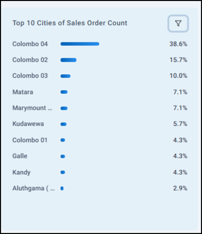
4. Top 10 Cities of Sales Order Count
Shows which cities generate the most orders with top 10 filter.
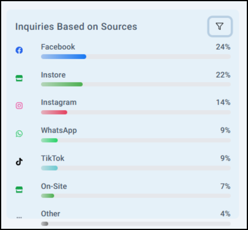
5. Inquiries Based on Sources
Break down where your inquiries are coming from (e.g., website, referrals).
Helps track marketing effectiveness.
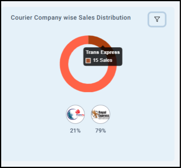
6. Courier Company Wise Sales Distribution
Shows which courier companies are used most for delivering sales orders.
Useful for logistics performance tracking.
7. Category-Wise Sales (Bar Chart)
Displays sales by product categories.
It is useful to see which product groups perform best.
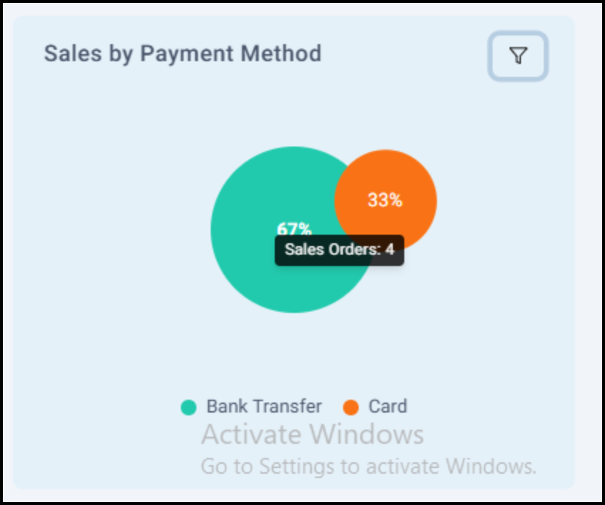
8. Sales by Payment Method
Shows sales distribution by payment modes (e.g., Cash, Card, Bank Transfer).
Helps finance teams monitor payment patterns.
Usage Tips
- Click the filter icons (🔽) to adjust time periods or select specific data (like this month, last month).


